Earlier this year, I wrote a blog that considered the evolution of email creative and how it has changed over the last decade. And, oh, how it has changed. Whilst there are multiple factors that have influenced these changes, the main reason is simply the increased usage of smartphones.
Just like web and app designers, who have poured resource into optimising mobile experiences, email marketers have to adapt.
A recent study by Litmus found that, on average, a person will spend eleven seconds reading an email. If the average reading speed is 308 words per minute that means only 56 words are read in that period. That’s about as many words as there are in this paragraph!
Contacts are more empowered. Attention spans have decreased. Content must be simple, digestible and visual.
Smartphone usage continues to grow internationally, and forecasts say there will be 2.5 billion smartphone users by 2019. That’s nice for the wider world but what about a little closer to home?
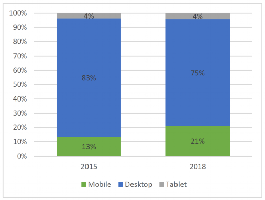
At Vuture we track millions of emails, year after year. Since 2015 we’ve been compiling these stats into a benchmarking dashboard. This dashboard compares your stats against other participating clients. Part of this dashboard shows the devices that your contacts use to open emails and since 2015 the overall number of mobile opens across all regions and sectors has increased from 13 to 21 per cent.
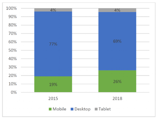
In US law the number of mobile opens has increased from 19 to 26 per cent

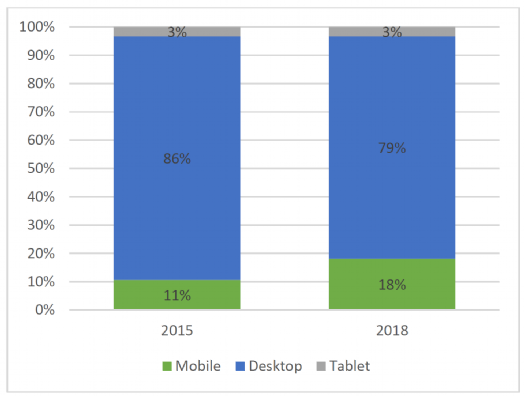
In UK law the number of mobile opens has increased from eleven to 18 per cent

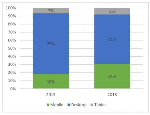
Financial Services has seen the biggest increase in the number of opens on a mobile device from 18 to 31 per cent

What these stats show us is that the usage of smartphones has increased significantly over the last three years, with no signs of slowing within law and professional services.
It is no longer an option to ignore the importance of having an email design that works for mobile. With over a fifth of all email opens happening on a mobile device, it is, therefor

